Monday, March 31, 2014

Watercolored Leaves


Hi everyone.  Today's card is for the Splitcoaststampers CAS challenge (#266 - design seeds color chart - still life blues).  Don't you just love these colors - they are so pretty!!


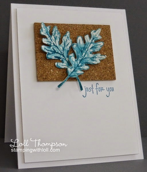
I really wanted to watercolor, so decided to pull out my favorite two-step stamps from Stampin' Up! - Gently Falling.  This set is perfect for using with watercolor paper.  I inked my solid stamp (using markers) with three shades of blue from the color palette, misted with water and stamped onto watercolor paper.  Once dry, I used the dark blue to ink the outline stamp, misted with water and stamped overtop ... using my Stamp-a-ma-jig to line things up.

I fussy cut the leaves and layered them on top of a piece of cork ... I'm happy with how this turned out.  But I can just imagine my son saying "Blue leaves Mom ... really??!" :)  Thank goodness we can take creative license with our images and colors because I LOVE my blue leaves :)

____________________


On another subject ...  I'm going to share a photo of my beautiful grandson, Cooper which was taken a couple of weeks ago.  It's not the best because there are shadows from his bassinet, but I LOVE the look on his face - makes me smile.  He's so happy and content ... and he brings so much joy to our family :)


Stamps:  Gently Falling (SU!); Autumn Sentiments (Amy R)
Paper:  White (Neenah); Watercolor
Ink:  Soft Sky, Baja Breeze, Island Indigo (SU!)
Accessories & Tools:  Water mister, Stamp-a-ma-jig, Cork


Challenges:
SCS CAS #266


Saturday, March 29, 2014

Love Grows


Hi everyone.  Time for a new challenge at Addicted to CAS.  This time, the challenge is being run by the very talented Sylvia (Poppy's Papercraft Patch), and she chose this word ...


Prize:  Rubber Stamp Set "It's All About You"
(please follow the rules to be eligible to win)


Now, I only used one wheel on my card ... so hope that's OK with Sylvia! :)

I inked the wheelbarrow with my gray marker and stamped.  I used my blender pen to add more ink to the wheelbarrow, masked it with a post-it note and then stamped leaf sprigs and flowers (yellow, red and purple) using generation stamping.  I removed the mask and stamped a few leaf sprigs that are falling over the side of the wheelbarrow and a few of the red flowers as well.  I like the watercolored look.

The sentiment is from a Fiskars set I had bought a while back from my local $1 store (it was $3.00 for the whole set).  I have several of these clear stamp sets, but find I don't always get a crisp and clean stamp from them so didn't use them very much.  Then I watched a video by Darlene Devries (DarleneDesign.com) ... where she describes having the same trouble and how she fixed this problem.  She places the stamp on her acrylic block, figures out where she wants it on her card, places a Stamp-a-ma-jig against the block, inks and stamps.  She lifts up her stamp, leaving the stamp-a-ma-jig in place, and re-inks and stamps again if necessary.  I did that today and it worked perfectly.  Thanks for the great tip Darlene!!  By the way, if you haven't checked out Darlene's blog, please do so if you have time ... she does a video each week showing how she makes her cards.  I have learned a lot from her!

This is the last challenge of March ... which means we have to bid fond farewell to our March Guest Designer ... Karen.  Thanks so much Karen for joining us this month ... we've really enjoyed having you on our Design Team!!! :)

As always, our challenge is open for two weeks so there's lots of time to play along.  Please check out the challenge for Addicted to CAS - Wheels ... and see all the wonderful cards from the rest of the Design Team.


Stamps:  Always Thanksful (SU!); Master #1 (Kittie Kits - Rubbernecker Stamps); Friendship Garden (Fiskars)
Paper:  White (Neenah - card base); Whisper White (SU!)
Ink:  Smoky Slate, Early Espresso, Basic Gray, Black, Gumball Green, Daffodil Delight, Real Red, Elegant Eggplant (SU!)
Accessories & Tools:  blender pen, Stamp-a-ma-jig


Thursday, March 27, 2014

White Tulips


Hi everyone.  Today's card uses the same image as yesterday's card.  This time I re-sized the image, making it much smaller and then cut out another stencil.  I placed the stencil over my card stock (secured with lots of removeable tape to keep everything in place) and then pounced with my Versamark stamp pad.  I quickly removed the stencil, poured white embossing powder over top and heat set.  I then randomly sponged yellow, green and blue inks, covering my main panel.  I used a paper towel to wipe away any ink that sat on top of my embossed tulips.

I decided to try a technique that I saw on Jennifer McGuire's blog yesterday ... she sponged on water color paper (mine is on Whisper White card stock from SU!), and then misted from about two feet above the image, leaving a very fine misting of water.  LOVE how it turned out.  Just adds some interest and texture to the piece.  I mounted my Whisper White sponged panel onto the same sized panel of a thicker card stock to add strength.

Since I had my white embossing powder out, I decided to also emboss the sentiment onto a strip of vellum.  I cut the vellum to the width I wanted, but left extra length, which I folded and tucked to the back and secured with tape.  That way I didn't need to figure out how to attach the sentiment without the glue showing, as it almost always does on vellum.  Worked great!  I am learning so much from other bloggers and am happy to pass along these tips and tricks.  That's what our crafting community is all about - sharing info and encouraging other's to try new things. :)


Stamps:  Sunny Sentiments (Amy R)
Paper:  White (Neenah - card base); Whisper White (SU!); Vellum
Ink:  Versamark; Daffodil Delight, Gumball Green, Tempting Turquoise (SU!)
Accessories & Tools:  Silhouette Cameo, plastic sheet for cutting stencil (Grafix), white embossing powder, heat tool, sponges, water mister


Wednesday, March 26, 2014

Stenciled Tulips


Hi everyone.  Quick post today ...

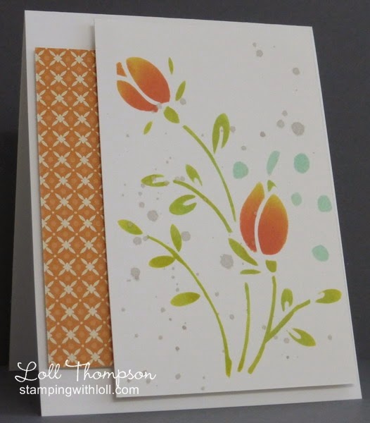
I used a cut file from Silhouette America to make my own tulip stencil for this card.  Love how this turned out!  I used the colors from SCS Color Challenge #471 - use at least three from this group of colors - black, pistachio pudding, crisp cantaloupe, pool party, sahara sand and summer starfruit.  These are all SU! colors but as long as you use similar colors, that's fine.  I don't have the pistachio color, so I sponged the stems and leaves in yellow and then over-sponged in the pale blue to get my green :)  I also didn't have the soft orange color, so sponged my tulips with yellow and over-sponged with coral.  I like how it turned out.  I mixed light gray re-inker with water and used a large brush (chopping with the side of my hand), to splatter the card front.  I didn't add a sentiment this time, so this card can be used for many different occasions.

I used another piece of my designer paper "collection" :) ... to add some pattern to the card.

Hope you are all having a great day! :)


Paper:  White (Neenah); Everyday Enchantment DSP (SU!)
Ink:  Summer Starfruit, Pool Party, Sahara Sand, Calypso Coral (SU!)
Accessories & Tools:  Silhouette Cameo, clear plastic sheet (Grafix), sponges, post-it notes for masking


Challenges:
SCS Color Challenge #471


Tuesday, March 25, 2014

Snowflake Experiment


Hi everyone.  As you can see by the title of my blog post for today, I was experimenting.  It turned out quite well, but photographing it was a whole other story.  The card is so much prettier in real life ... but you'll have to take my word on that.  I made this for the current challenge at Festive Friday #27 ... here's the inspiration photo ...


I die-cut a snowflake from clear plastic, coated it with crystal effect (glossy accents), and then covered it with lots and lots of glitter.  When it was dry, I put on a thick coat of crystal effects to seal in the glitter and give the snowflake some dimension.  I mounted it onto a black card front.  Unfortunately, all the colors from the iridescent glitter (pink, blue, purple) don't show in the photo.  Here's a close-up ... but it's still not a great photo.


The glitter not only gives the snowflake sparkle and flecks of color, but it gives it a frosty appearance.  It was fun experimenting with my clear plastic sheets and will be doing more of that soon. :)


Stamps:  Snowman Sayings (Amy R)
Paper:  Black (SU!)
Ink:  Versamark
Accessories & Tools:  Silhouette Cameo, plastic sheets (Grafix), embossing buddy, white embossing powder, heat tool, crystal effects, glitter, glue dots, paint brush


Challenges:
Festive Friday #27


Monday, March 24, 2014

Colour Block Fern


Hi everyone.  My plan this year as to use up some of the reams of patterned paper I have purchased over the past several years ... some of which is just sitting there collecting dust.  So far I've managed to make a few cards this year with patterned paper, but really need to step it up ... at least I managed to use three pieces today - yay! :)

This card is a CASE (copy and share everything) of one that I've had pinned for over a year.  Check out this beauty by Doni High - love it!!  The changes I made was to add a third background panel and change the colors.  This is also for three challenges ... first, the CAS #265 challenge at Splitcoaststampers (you must be a member to join in - membership is FREE!).  The challenge is to use Color Blocking.  I interpreted it a little different, using the designer paper as my color blocks ... oh, and the added challenge was to include a die-cut or punch - this is one of my favorite Cheery Lynn dies that I own.  I love the design of this paper (it's all from the same set) ... earthy, vintage and masculine - perfect match for the fern die-cut.  I'm also entering this into the CAS on Sunday challenge #29 - One Layer Wonder.  It's not often I make one-layer cards ... something else that I need to work on.  And I'm also adding this to the Less Is More Challenge #164 - Three (there are three background panels).

This was a quick and easy card.  I sponged around all three pieces with dark brown ink to tie them together, and then popped up the middle and top panel.  I glued the fern in place.


Stamps:  Bitty Birthday (SU!)
Paper:  White (Neenah); Generations (Simple Stories); Early Espresso (SU!)
Ink:  Early Espresso (SU!)
Accessories & Tools:  Big Shot, Fern die (Cheery Lynn), sponge, Stamp-a-ma-jig


Challenges:
CAS #265 - color blocking
CAS on Sunday #29 - OLW
Less Is More #164 - Three


Friday, March 21, 2014

Coral Lily


Hi everyone.  I seem to be stuck on flower cards these days ... and on the yellow and coral color combo :)  I'm going to enter this into the Crazy for CAS (#40 - photo inspiration) as a second entry into this wonderful challenge.


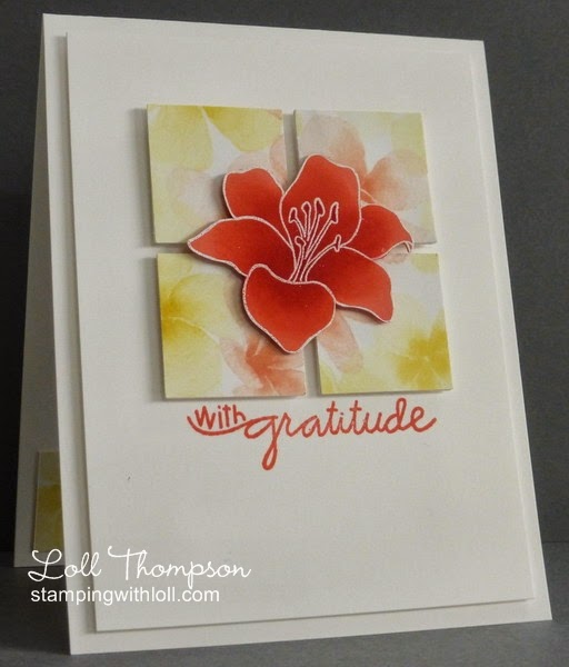
Today I used a beautiful background paper from SU! that I received from my good friend Nancy.  She sent me a package with a lovely hand-made card and lots of goodies for me to play with (designer papers, vellum with gold accents, lattice die-cut, twine, etc.).  I LOVE this designer paper that has the look of watercoloring.  I wanted something bold to play off the soft colors of the background, so stamped and white embossed the lily on coral card stock and then added shading with my sponges of more coral and red to give it lots of oomph! :)

I have been working the past few days on catching up on visiting and commenting on other's blogs.  I got about a week behind and it is amazing how many wonderful creations I had missed in that short time.  I have been around to most everyone's blog by now ... sometimes I left messages, but if not, I did see all the lovely cards and appreciate each and every blog that I visit!  Life has been crazy.  My DMIL has cancer and was moved to a hospice just over a week ago.  It's tough, but she is in good spirits and is in no pain ... we are so thankful.  The wonderful nurses and doctors at the hospice are taking good care of her ... making her as comfortable as possible.  Hubby is here every day to spend time with her ... and I go usually every other day so that I can spend time with her and she also has time with just Gord.  It's hard to see her getting weaker and weaker.

I managed to make a few cards this week, even though my time in the studio is limited.  Card making gives me an escape from the realities of life ... if only for a short time.


Stamps:  Fifth Avenue Floral (SU!); Chit Chat (Paper Smooches)
Paper:  White (Neenah); Watercolor Wonder Designer Paper, Calypso Coral (SU!)
Ink:  Versamark, Calypso Coral, Real Red (SU!)
Accessories & Tools:  white embossing powder, heat tool, sponges


Challenges:
Crazy for CAS #40


Wednesday, March 19, 2014

Spring is here!


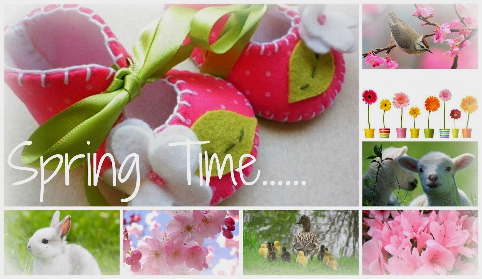
Hi everyone.  I had a little time to play today, so I made a card for the Paper Players Challenge (#187 - CAS - Spring) that is being hosted by my friend and fellow DT member, Jaydee.  I love CAS ... and I love Spring :)  Perfect, right??!! :)  Also adding this to the Crazy For CAS Challenge #40 (photo inspiration below).


I thought this would be a fun and whimsical card with the bright colors, fun flower die-cuts and the sentiment that is almost like a child's printing.  But once it was paired with the window die-cut ... it took on a little more of an elegant look.  Funny how that happens.  I am loving all this gorgeous white space ... yummy!! ... and it just makes the bright flowers pop off the page.  I sponged around all the edges of the leaf sprigs, and flowers with corresponding inks.  I shaped them all as well, using my stylus and mat ... and I added white dots to the centers of the flowers.  Oh, and I glued the leaves and flowers in place using Crystal Effects ... this helps to keep the shaped flowers from flattening.  This card was fun to make! :)

I had some left over flower die-cuts and decided to make another card, this time using a wood grain embossed circle in place of the window.  Another fun and easy card.  I'd like to enter both into the Paper Players challenge, but haven't figured out how to do that when they are both in the same post, so I'll just pick one and hope their DT reads this post and considers both cards.


I'll include the details for these cards at the end of the post, but I have something else I want to share with you before I go ....

____________________


Here's a few more cards made by friends of mine, using copper.  It's amazing how each one is so unique and the colors are just amazing.

Copper Birds by Bonnie (Stamping with Klass)


Copper Leaf by Lee-Anne (Creatively LA)


Copper Flower by Lee-Anne (Creatively LA)


Both these card markers are so talented ... if you haven't yet visited their blogs, I recommend you check them out ... I know you will be inspired!

Thanks Bonnie and Lee-Anne for letting me share your cards - you are AWESOME!!


Spring cards:
Stamps:  Spring is here (Penny Black)
Paper:  White (Neenah); Certainly Celery, Daffodil Delight, Tangerine Tango, Regal Rose (SU!)
Ink:  Pear Pizzazz, Crushed Curry, Tangerine Tango, Regal Rose (SU!)
Accessories & Tools:  Big Shot, Five Point Flower die (C.C. Designs), Little Leaves die (Sizzix), Fresh Foliage die (Memory Box), Circle Nestability (Spellbinders), Woodgrain embossing folder (Sizzix), Small Madison Arched Window die (Poppy Stamps), sponges, stylus and mat, white gel pen, crystal effects


Challenge:
Paper Players #187 - CAS Spring
Crazy for CAS #40 - photo inspiraton


Tuesday, March 18, 2014

Happy Birthday Anita!


Hi everyone.  Today is a special post to honor Anita in France (My Papercraft World).  Turns out it was her birthday a month ago, but she didn't let anyone know :)  So there is a special Belated Birthday Party created for Anita today by Darnell and Bev to celebrate Anita's birthday and they would love for lots of people to join in --- here's my entry.  Come and join in on Darnell's blog (djkardkreations).

I hope you had a wonderful birthday Anita ... and I hope you enjoy today and your special Belated Birthday Party! :)


Here's the details ...

This card is a little different than my normal style ... I usually have lots of white space, but not today.  I cut out a stencil using my Cameo cutting machine and thick plastic.  I then sponged over the stencil with one of my favorite combos - yellow, orange and pink.  It turned out so pretty.  I love the swirly design with the sponged colors that mix together to create different shades.  I decided to use it as my card front, cutting a circle from the middle so I could recess my sentiment and leaf sprig with flowers.


Stamps:  Bitty Birthday (SU!)
Paper:  White (Neenah); Whisper White, Certainly Celery, Calypso Coral (SU!)
Ink:  Daffodil Delight, Tangerine Tango, Regal Rose, Calypso Coral (SU!)
Accessories & Tools:  Silhouette Cameo, plastic sheet for stencil, sponges, Little Leaves die (Sizzix), Circle Nestabilities (Spellbinders), Hydrangea punch (Martha Stewart), white gel pen, crystal effects


Saturday, March 15, 2014

Luck O' the Irish


Hi everyone.  Time for the newest challenge at Addicted to CAS - #34.  This challenge is being hosted by the fabulous Sandie (London Days) ... and she has chosen this timely word ...


Prize:  Stamp Set "It's all about you"
(Please follow the rules to be eligible to win)


Quick and very easy card today ... with my Silhouette Cameo doing most of the work :)  I downloaded this wonderful "subway" style large sentiment stamp.  I cut out a shamrock charm, coated it with Crystal Effects and then attached it using a silver brad.  Tip I learned from Jackie Topa:  use the tips of your scissors as a shim between the brad and your cardstock, and then open the tines at the back.  This way there will be some space so the charm is not pinched tight to the card ... the shamrock swings back and forth, adding interest to the card. :)

As always, the challenge for ATCAS #34 - Luck will be open for a full two weeks so there's lots of time to play.  You'll see there are some St. Patrick's Day cards done by the DT ... but luck can be a sentiment for many different occasions.  I hope you'll join us and have a chance to win some prizes.  We are lucky to have Karen as our Guest Designer for the month of March ... so check out the link to the challenge to see Karen's adorable card ... and the rest of the DTs fabulous cards - you'll be glad you did! :)


Stamps:  Digital image (Silhouette America)
Paper:  white (Neenah), gumball green (SU!)
Accessories & Tools:  Silhouette Cameo, printer, crystal effects, silver brad


Thursday, March 13, 2014

Watercoloured Rose


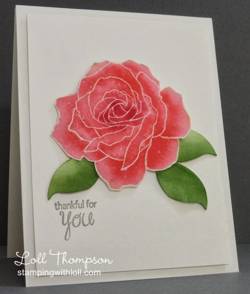
Hi everyone.  I had some fun playing with watercolor paper and re-inkers.  I heat embossed this large rose from SU! and then wet my paper and added re-inkers with lots of water.  I splattered the rose with white and also with Crystal Effects.  For the leaves, I simply die-cut them from watercolor paper, sponged on the green ink and then used my Aqua Painter to add water.  A simple sentiment finishes the card.  It's fun playing with watercolor paper ... you just never know what you're going to get! :)

I'm going to enter this into a new challenge blog run by the very talented Virginia Lu ---  Virginia's View Challenge #1 is Watercoloring.  There are lots of very beautiful entries ... so much to look at!

And I'm entering this into the 1st challenge at the new challenge blog - Time Out, run by two of my friends, Sandie and Nonni.  The first challenge is to be inspired by these words:  Dancing in the Rain.  My rose has been out dancing in the rain :) .... can you see the raindrops on it??

On another note, I am honored today to have one of my cards featured at Paper Smooches - thanks Kim!  Check out this link to take a look.


Stamps:  Fifth Avenue Floral (SU!), Be Happy Sentiments (Amy R)
Paper:  White (Neenah); watercolor
Ink:  Pretty in Pink, Regal Rose, Rose Red, Smoky Slate, Garden Green (SU!)
Accessories & Tools:  clear embossing powder, heat tool, brushes, aqua painter, sponge


Challenges:
Virginia's View #1
Time Out #1

Tuesday, March 11, 2014

More Copper from my friends

Hi everyone.  Quick post as I just wanted to follow-up on my copper post from a few days ago.  I have sent a few of the heated sheets to crafty friends and wanted to include cards made by them ....

First up, two cards made by my good friend Nancy.  Nancy doesn't have a blog, but if you click on this link, it will take you to her Splitcoast Stampers Gallery and hopefully you'll be able to look at all her wonderful work.  Not sure if you have to be a member to view her gallery, but membership is free ... you just have to sign up and you have access to hundreds of thousands of handmade cards as well as challenges and tutorials, and (of course), Nancy's amazing gallery of cards. :)  Otherwise, you can see her copper cards below ...


Next up is my friend (and owner of ATCAS and ATS&M), Kylie.  Here's a link to Kylie's blog which is full of creative and inspiring cards.  


... and one from my friend and fellow DT member at ATCAS, Sandie.  Here's a link to Sandie's blog, which is full of fabulous CAS cards.


Thanks to Nancy, Kylie and Sandie for letting me share their beautiful copper cards with you!!

Edited to Add:

Jacquie just sent me a picture of a copper card she made that was inspired by me (I'm honored!) :) ... so I wanted to share it with you as well.  She is the one that told me about using a heat gun on the copper --- thanks again Jacquie!!  I love the amazing colors she got on the copper! :)


Saturday, March 08, 2014

Copper Technique

Hi everyone.  A few followers have recently tried the copper technique that I use on my cards ... some had success, some not.  So I thought I'd dedicate this post to the "ins and outs" of using copper (from my experience).  The tips are at the bottom of this post for those interested.

First I'm going to share two cards that use copper in a different way than die-cuts.

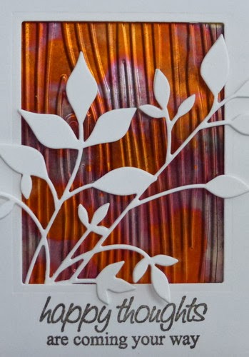
Embossed copper is simply amazing.  Because it is thicker than card stock, it really embosses deeply.  Makes for a beautiful background ...


This has the heated copper embossed with a woodgrain folder.  Simple.  I added a white die-cut of leaves and a frame with simple sentiment.  I'm including a close-up of the embossed copper so you can see even more detail ...


If you wanted to have a die-cut copper object on your card, but don't have a die that will cut through the thick copper, here's an alternative.  Use your card stock card front to die-cut your image and use the negative, backed with copper.  This way you have your object in copper, but from a different perspective.


I die-cut the leaf on my main card stock panel and then glued a solid piece of heated copper behind it ... a simple alternative to a die-cut copper leaf.  I'll include a close-up so you can see the details ...


I hope this encourages those of you that have had some frustrations using copper.  As always, feel free to email me if you have any questions (link is in the right column near the top).

____________________


Copper Sheets:

My supplier for copper is in Canada ($22/roll), but they purchase it from the manufacturer in USA.

Manufacturers:

K&S Precision Metals - Chicago Illinois (click link for their website with list of retailers).
#6020 - Soft Copper (.005 thick - 36 gauge) is the copper I use and it comes in 12" x 30" rolls (find it under Craft Products).  Their copper is wonderful and turns lovely shades of orange, pink, and blue when heated.  I found out that you can purchase this copper at Hobby Lobby's on-line store (thanks for the info Nancy!).

I have also bought copper from Basic Copper - also based in Chicago, Illinois (same thickness).  Their copper is a little different.  Still works well, but when heated turns more golds and not the rainbow of colors I get from the other manufacturer.


Tips for heating Copper:

Copper sheets are heated until they start to turn color (orange, pink, blue) ... it's so pretty!


  • Use a mini torch (creme brulee torch from kitchen supply store works well).  There is an alternative!!  Jacquie follows my blog and contacted me to say that she used a heat gun (high wattage) --- thanks Jacquie!!  I hadn't even thought of giving that a try.  My heat gun is "borrowed" from hubby's workshop.  It originally was intended to strip paint, so it is high heat (1200 watts).  I tried it today - success!!  It does heat the copper slower, so I had more time to react once it starts to turn color.  It takes a little longer than the torch, but I love the control of it and will be experimenting further.  The craft heat guns do not have enough power and heat to work on copper ... at least that's what I've been told.
  • No matter what you use to heat the copper, it is easier to heat a full sheet and then die-cut / cut for your project.  You have more control because a large sheet (I usually cut them 5" x 6") heats slower than if you had a small die-cut and were trying to heat it.  This is what I do for my mini torch.  If using a craft heat tool, maybe die-cutting first and then heating a smaller piece won't take as much time - need to experiment further with that).

  • If  the copper becomes overheated, it turns a silver color.  To avoid that from happening (I always get some silver on my sheets - but not the majority), I keep my torch above the copper (about three or four inches) and moving at all times.  As soon as I see a section start to turn color, I pull the torch away ... there is a delay and the copper will continue to change for a second or two, so under-heating is the way to go until you are comfortable.


Tips for cutting (die-cutting) Copper:

Copper is soft and can be cut with scissors.  Because it is thicker than card stock, it embosses really beautifully using the embossing folders and makes wonderful backgrounds.

It can be die-cut … some dies work better than others:

  •  The original Sizzix dies (steel-rule) cut through it easily – usually with one pass.

  • Thin steel dies that are just an outline die work fairly well, although you may need to add a shim of card stock to put extra pressure.  Running it back and forth through your machine a couple of times also helps.

  • The thin wafer steel dies aren’t the best for this technique, but it depends on the brand ... so it’s a matter of experimenting (I have had success with some Cheery Lynn leaf dies only).  Again, use a shim to add more pressure if you need to.  Also, run it back and forth through your machine several times.  If it mostly cuts, but leaves little bits attached, you can use your scissors to get the tough parts, but BE CAREFUL, the edges are very sharp!  If it doesn't cut through at all, then it's not going to no matter what you do ... it will emboss the image and that's another way to use copper.


After die-cutting the pieces, running it through a die-cutting machine just between the cutting plates (no dies or shims), flattens out any sharp edges you may get during die-cutting.  A stylus works well to add shape afterwards if you don’t want it flat.


And, if you want to make the die-cuts thicker, you can die-cut the same image in card stock and glue to the back of the copper die-cut (this also helps eliminate any sharp edges).  Tombow Multi-glue works well for me, but there are probably lots of glues that will work.

Hope this helps!


Stamps:  Sunny Sentiments (Amy R) (card 1); Many Thanks (Paper Smooches (card 2)
Paper:  White
Ink:  Early Espresso (SU!)
Accessories & Tools:  Big Shot, Fresh Foliage die (Memory Box), Meadow Leaf die (Poppy Stamps), copper sheet, mini torch (card 1), heat tool (card 2), woodgrain embossing folder (Sizzix)



Friday, March 07, 2014

Gingham Smiles


Hi everyone.  Here is my third and final card for my card class this Saturday.  After designing two elegant cards, I thought it would be fun to have something a little more whimsical ... a watering can full of spring flowers.  Love the gingham watering can ... you can't go wrong with gingham (or polka-dots!). :)

This time I shaped the watering can rather than the leaves of the bouquet.  I'm really happy how it turned out.  The photograph doesn't show the 3-D effect, but trust me, it turned out well.  I cut apart the pieces of the watering can (handle, spout, main part) so that I could sponge around all pieces for added dimension, but it also allowed me to shape each piece with my stylus and give them a "roundness".

Unfortunately, it's been a tough week for both my cousins, so they emailed me asking to postpone for a little while.  Life can be stressful when working and going to school - so I totally understand.  Good thing is I have the designs ready for whenever we can reschedule. :)

I had a lot of fun designing the three cards for this class and am excited about sharing these techniques - hopefully soon! :)


Stamps:  Sweet Summer Sentiments (Amy R)
Paper:  White (Neenah); Yellow Gingham (Making Memories); Gumball Green, Crushed Curry (SU!)
Ink:  Crushed Curry, Gumball Green, Pumpkin Pie, Early Espresso (SU!)
Accessories & Tools:  Big Shot, Little Leaves die (Sizzix), 8 Petal flowers die (C.C. Designs), Watering Can die (Silhouette Cameo), sponges, white gel pen, Stamp-a-ma-jig, stylus and mat


Thursday, March 06, 2014

Madera Hello


Hi everyone.  Back with a second card for the class I'm teaching this coming weekend.  This card uses the same background technique (faux mother-of-pearl) and the same sentiment as yesterday's card.  I wanted to show the girls that making color changes and a different shape gives a completely different card.

When I made my faux mother-of-pearl piece, I used a full A2 card front (4 1/4" x 5 1/2").  Before I sponged on any color, I cut off a small strip (2 1/4" x 2 3/4") for yesterday's card, leaving this larger piece for today.  All I needed to do was to figure out what colors of ink to use and go from there.

I sponged three shades of blue ink on this (although the lighter one probably doesn't show much) - Pool Party, Bermuda Bay, Tempting Turquoise.  I sponged heaviest with Bermuda Bay (LOVE it!) ... and so that dictated the color of my blooms.  This is my favorite flower that I own ... it's the hydrangea punch from Martha Stewart.  I've had it for several years and use it a lot.  I paired it today with the Madera Corner die from Memory Box - they work so well together.  I added sponging, shaping, veins and dots for interest on the flowers and then secured them to the corner die using crystal effects (same as glossy accents).  I learned this trick from Jennifer McGuire.  If you place a good sized drop of crystal effects and then push your shaped bloom into it, when it dries, it helps to keep the bloom shape.  It works!

The sentiment took me a couple of tries with this.  I first stamped and heat embossed it in white directly on my main panel ... it didn't show up enough on the pearl background.  So I stamped it onto a small strip of card stock and added it as a banner, placing over top of my embossed sentiment ... always good when you can figure out a way to save a piece. :)


Stamps:  Where your heart is (Simon Says)
Paper:  White (Neenah); Bermuda Bay (SU!)
Ink:  Pool Party, Bermuda Bay, Tempting Turquoise (SU!)
Accessories & Tools:  Big Shot, Madera Corner die (Memory Box), Hydrandea Punch (Martha Stewart), Nestabilities Labels Two (Spellbinders), Frost Shimmer Paint (SU!), saran wrap, stylus and mat, white gel pen, crystal effects,