Thursday, June 30, 2011

Summer Sunflowers

Where has the year gone??  Canada Day is tomorrow and we're still waiting for the "real" summer to arrive.  My garden has been neglected because there have been so many rainy days ... pfffffffff

So I decided to create my own summer feeling with today's card (another clean & simple design).  The challenge today for "Ways to Use it" is "Something old, something new".  I used a stamp set that I've had for a couple of years and had to blow the dust off before I could start :)  The new thing is the Nestabilities Label Two that I purchased a couple of months ago.  I didn't use it to cut out a frame or backdrop, I used it as a stencil and outlined the shape with my Stampin' Write marker.  It's always good to find another way to use tools!!  Hope you like.

"Summer Sunflowers"


Stamps:  A Flower for All Seasons, Happy Moments (sentiment) (SU!)
Paper:  Daffodil Delight, Whisper White (SU!)
Ink:  Soft Suede; Stampin' Write markers:  Daffodil Delight, Pumpkin Pie, Real Red, Soft Suede, Sahara Sand, Old Olive (SU!)
Accessories & Tools:  Nestabilities Label Two, 1/4" Pumpkin Pie grosgrain ribbon, sticky strips
 
* * * * *
 
I stamped the image with Soft Suede ink onto Whisper White cardstock.  I colored in the flowers, pot and lady bug using the Stampin' Write markers.  I used the Nestabilities Label Two as a stencil and outlined the shape with the thick end of the Pumpkin Pie Stampin' Write markers.  I stamped the sentiment also in Pumpkin Pie ink.

I tied a knot of ribbon about 1/3 from the bottom and then mounted the panel onto the card base of Daffodil Delight.  Easy, quick and fun to make!!
 

Wednesday, June 29, 2011

Grand Love


My friend Liz took me out for lunch today to celebrate my birthday.  We headed to a small, cozy restaurant in North Delta called "Applewoods".  We had a lovely lunch, followed by the best Strawberry Rhubarb pie I've every eaten!!  Applewoods serves lunch and high tea and their baked goods are awesome!!  After Liz dropped me back at home, I headed into the studio.  I had an idea in my head for today's sketch challenge and wanted to make it with the clean & simple challenge colors from Monday (Red, Black & White).  I printed the grand piano image on my computer to use as the main image.  Hope you like.
 
"Grand Love"
 

Stamps:  Musical Notes Wheel, Fifth Avenue Floral, Short & Sweet (SU!); computer generated main image
Paper:  Cherry Cobbler, Basic Black, Whisper White (SU!)
Ink:  Basic Black, Versamark (SU!)
Accessories & Tools:  Wheel guide, adhesives & dimensionals
 
* * * * *
 
I made my own wheel guide by adding lots of pop-ups from the $1 store to the underside of a 12" ruler - it works really well!!  I used the wheel guide to stamp the musical notes four times across the background strip.

I stamped the rose from the Fifth Avenue Floral set in Versamark all over the card base of Cherry Cobbler (hard to tell in the photo - it's very subtle).

I framed all the pieces of the card with Basic Black cardstock and mounted them as per the picture above, popping up the main image and sentiment with dimensionals.  This was a quick and easy card.

Tuesday, June 28, 2011

Cone Flowers


Today I'm covering off two challenges ... WT328 from last Thursday (Ways to use it - No White Cardstock) and CC329 (today's color challenge - Soft Suede, Melon Mambo, Crumb Cake).  I don't have Melon Mambo so I substituted my closest color, Regal Rose.
 
I had looked at Jackie Topa's website last year and she made "snow" for her winter cards by rolling up a piece of cardstock into a tight tube and then grating it with her kitchen grater.  What an awesome idea! ... and I thought the texture would be perfect for the centers for these Cone Flowers.  Hope you like.
 
"Cone Flowers"
 

Stamps:  Inspired by Nature, En Francais (SU!)
Paper:  Soft Suede, Crumb Cake (SU!)
Ink:  Soft Suede, Regal Rose (SU!)
Accessories & Tools:  sponges, Scor-Pal, grater, Nestabilities Classic Rectangles Large, Tombow glue, adhesives and dimensionals
 
* * * * *
 
I stamped both flower images onto Crumb Cake cardstock using Soft Suede and Regal Rose inks and cut them out.  I did a second stamping (petals only), cut them out and then sponged the edges with Soft Suede ink.  I layered the extra petals on top of the base flowers, popping up the end of the petals with dimensionals, but adhering the tops of the petals (near the center of the flowers) with adhesives so it was flush.  I rolled up a piece of Soft Suede cardstock into a tight tube, grated it and glued the "fluff" onto the center of the flowers.  Once dry, I rubbed off any loose, excess fluff.

I stamped the En Frances stamp onto Crumb Cake cardstock using Soft Suede ink and then cut out the middle with the Nestabilities.  I trimmed the edges to create a frame and then sponged with Soft Suede ink.  I cut out another piece of Crumb Cake (slightly smaller than the outside dimensions of the frame and used the Scor-Pal to add vertical lines every 1/4".  I sponged the scored cardstock with Soft Suede ink to highlight the scoring and attached it behind the frame using dimensionals.

I adhered the flowers to the frame and attached the whole main panel to the card base, again using dimensionals to add depth.  I stamped the sentiment in Regal Rose ink and cut a frame out of Soft Suede cardstock.  I sponged the edges of the sentiment and the frame with Soft Suede and adhered it to the frame.

Monday, June 27, 2011

Shop 'til you Drop!

I am so blessed!  We had a family dinner last night to celebrate my birthday (which is today).  I had such a wonderful day yesterday, spending a lot of time out on the deck enjoying the beautiful weather and listening to music.  Then I got to enjoy spending the evening with my kids and grand-doggie.  My hubby makes the best salmon I've ever tasted, so I requested it for my birthday.  Why go out to a restaurant when you can have delicious Teriyaki Cedar Plank Salmon at home??!!  And my future DIL made delicious cupcakes - two kinds, fresh strawberries & vanilla - and red velvet.  Thank you Nikki!!
 
This morning, hubby and I enjoyed coffee on the deck until about 10:30 and then headed out for a late breakfast as IHOP.  Nice start to the day!!
 
I look forward to Monday's Challenge on Splitcoaststampers - Clean & Simple.  Today it's a color challenge - Red, Black & White.  Love those colors together - so striking.  I'm inspired by my friend Frances who made a similar card a few years back.  It's the perfect card for a friend that loves (or lives!) to shop!  Reminds me of my friend Kelly - it's her passion ... and these are her favorite colors too!  Hope you like.
 
"Shop 'til you Drop!"


Stamps:  Playful Pieces (SU!); computer generated sentiment
Paper:  Basic Black, Whisper White (SU!)
Ink:  Versamark, Basic Black (SU!)
Accessories & Tools:  Black embossing powder, heat tool, Tombow glue, red tissue paper, adhesives and dimensionals.
 
* * * * *
 
I inked the three rectangles with Versamark, stamped onto Whisper White cardstock, and heat embossed with black.  I stamped the handle in Black and then cut out the handles and embossed rectangles.  I used a little glue to attach the handles to the "bags".

I printed the sentiment on my computer onto Whisper White cardstock and cut to size.  I mounted the shopping bags just above the sentiment, adding red tissue in-behind and popping up the bags with dimensionals to add depth.  I mounted the main image onto a card base of Basic Black.  Easy peasy!! :)

Saturday, June 25, 2011

Pot of Flowers

I saw an on-line advertisement for Art Impressions and checked out their website.  I think their stamps are really nice, but a little on the pricey side.  Anyways, I watched several of their video tutorials on how to watercolor with stamps ... the artist, Bonnie Krebs, is the owner of AI.  She is very talented and makes it look so easy on the videos.  Of course, as with doing anything well, it takes practice, practice, practice.  I decided to give it a go, improvising with the stamps I already have.  I'm pretty happy with how it turned out for one of my first tries using this technique.  Hope you like.
 
"Pot of Flowers"
 

Stamps:  Clay Pot (Rubber-Art Stamps); Grass (Stampscapes); Flowers:  Pocket Silhouettes, Silhouette Sentiments (SU!)
Paper:  Perfect Plum, Elegant Eggplant (SU!); Watercolor paper (Arches 140lb. cold-press "Natural White")
Ink:  Old Olive, Soft Suede, Bashful Blue, Elegant Eggplant, Rose Red, Always Artichoke, Daffodil Delight
Accessories & Tools:  Artist's brushes, Palette, Stamp-a-ma-jig, Sizzix Square Lattice embossing folder, sticky strips and dimensionals
 
* * * * *
 
I started with the watercolor.  I inked the pot in Soft Suede and stamped onto the watercolor paper.  I dipped my brush in water and pinched out most of it, leaving just a little water on the brush.  I went along the outlines of the pot to soften the lines (this is the technique used with each stamping).  I masked the top of the pot.  I added grass in Old Olive with my Stampscapes "Old Fence" stamp, tall purple flowers with my Pocket Silhouette stamp, vine and pink flowers with my Silhouette Sentiment stamps and just dots of yellow for the yellow flowers - each time, softening the stampings with water.  I scribbled Old Olive ink (Stampin' Write marker) onto my Palette, added lots of water and did a wash along the bottom of the pot.  I scribbled Bashful Blue ink (Stampin' Write marker) onto my Palette, added lots of water and did a wash in the sky area behind the pot.

I ran a piece of Elegant Eggplant cardstock through my Big Shot with the Square Lattice embossing folder and then cut it to size.  I mounted it on my card base of Perfect Plum using sticky strips.  I mounted the main image onto a frame of Perfect Plum with sticky strips and mounted it on top of the embossed background using dimensionals to give it depth.

Friday, June 24, 2011

Ripened Pear


Received this months newsletter from Alison Solven (Canada Inks Up! for SU!) with a new color challenge:  Daffodil Delight, Crumb Cake, Real Red and Basic Black.  Three of the four are very dramatic colors so I decided to mute two of them using Crumb Cake.  The background embossed paper is Crumb Cake which has been sponged with Daffodil Delight - I love the color I ended up with!!  And the pear is sponged all over with Crumb Cake ink, then Daffodil Delight ink in the center part of the pear and a little Real Red on the "ripest" part.  So I did manage to cover off all four colors in my card, with just a smidgen of red :)  As usual my style is more often than not, CAS (Clean and Simple).  Hope you like.
 
"Ripened Pear"
 

Stamps:  Faith in Nature (SU!)
Paper:  Basic Black, Crumb Cake, Whisper White (SU!)
Ink:  Crumb Cake, Daffodil Delight, Real Red, Versamark (SU!)
Accessories & Tools:  Black embossing powder, heat tool, sponges, Sizzix Square Lattice embossing folder, 5/8" Basic Black satin ribbon, sticky strips and dimensionals
 
* * * * *
 
I used Versarmark for the stamp and then embossed in black.  I lightly sponged Crumb Cake ink on the leaf and the whole pear.  I sponged Daffodil Delight ink onto the main part of the pear, just leaving the very outside Crumb Cake.  I sponged a small amount of Real Red ink onto the ball part of the pear, where it would appear to ripen the most.  I love the combination of these colors sponged together!

I sponged a large piece of Crumb Cake cardstock with Daffodil Delight ink and then ran it through the Big Shot with the Square Lattice embossing folder (and then cut to size).  I used sticky strips to adhere the background embossed paper to the card base of Basic Black.  I added a frame of Basic Black to the main image and added a knot of black satin ribbon around the bottom.  I mounted all the pieces as shown in the picture above, popping up the main image with dimensionals for added depth.

Thursday, June 23, 2011

Pine Forest in the Misty Morning


I made a quick and easy card today.  I love sponging and have been experimenting with sponging different combinations of colors together.  Today I used mostly blues, with a little yellow and green thrown in for good luck!  Hope you like.
 
"Pine Forest in the Misty Morning"
 

Stamps:  Lovely as a Tree (SU!); Stampscapes (gulls)
Paper:  Not Quite Navy, Whisper White (SU!)
Ink:  Barely Banana (retired), Garden Green, Baja Breeze, Tempting Turquoise, Pacific Point, Not Quite Navy, Night of Navy (SU!)
Accessories & Tools:  1 1/4" circle punch, post-it note for masking, Stamp-a-ma-jig, sponges, sticky strips
 
* * * * *
 
I light sponged Barely Banana ink over the area where I wanted the sun to be and then added the mask on top.  I sponged Baja Breeze ink around the sun.  I sponged Tempting Turquoise ink around the sun, further out and not covering all the Baja Breeze.  I kept sponging more colors further and further from the sun making sure to leave some of the previous color showing (Pacific Point, Not Quite Navy, Night of Navy).  I removed the mask and lightly sponged Baja Breeze ink around the edges of the sun to soften the look.  I stamped the pine trees in Garden Green, mostly first generation stamping, but a few second and one third to make it appear as if some of the trees where in the distance.  I added the gulls stamped in Night of Navy.

I sponged the background paper in the same way as the main image, minus the sun.  I wanted it to look like the same sky, so I added a little Garden Green to mimic the yellow and blue combined inks in the main image.  I used my Stamp-a-ma-jig to line up the stamping from the main image and add to the background paper.  It's a little tricky, but I thought I did pretty well for my first attempt at this (but there's always room for improvement!).

I mounted all the pieces as shown in the picture above.
 
____________________ 
 
 
I realized a while ago that my stash of cards had been stacking up.  I wanted to do something worthwhile with them so about two months ago I donated two dozen cards to a charity through my old workplace (I have been retired for 2 1/2 years now).  In the building where I used to work, is a small store for employees to purchase snacks, small gifts, and cards with the profits from the store used to help fund a community project.  100% of the sale of my cards will go to the community project.  
 
Also, a friend of mine has ties to a senior's home in Burnaby and has arranged for my donated cards (three dozen) to be available for the residents.  I think the residents will appreciate being able to give hand-made cards to friends and family!  I really happy about it!!
 
I'm still looking for more places to donate my cards as I still have a large stash.  I really like the idea of them going to individuals as opposed to being sold.  I have to work on finding another place that would be interested in receiving my cards.

Tuesday, June 21, 2011

Birds and Blooms


Today's color challenge is "Cherry Night Cakes", meaning SU! colors Cherry Cobbler, Night of Navy and Crumb Cake.  Used two stamps that I haven't used before, so it definitely was a challenge :)  Hope you like.
 
"Birds & Blooms"
 

Stamps:  Simply Soft (2-part stamp), Four Frames (SU!)
Paper:  Night of Navy, Cherry Cobbler, Crumb Cake, Whisper White (SU!)
Ink:  Night of Navy, Cherry Cobbler, Crumb Cake
Accessories & Tools:  Stamp-a-ma-jig, masking tape, Cuttlebug "Birds & Swirls" embossing folder, hemp twine, sticky strips and dimensionals
 
* * * * *
 
I stamped the branches twice (second stamping I masked the smaller branch and only stamped the larger one) in Crumb Cake ink.  I used my Stamp-a-ma-jig to align the second part of the stamp (blossoms - done in Cherry Cobbler ink)), again masking the smaller blossoms for the second stamping).  I inked the bird from the Four Frames stamp set in Night of Navy ink and used the Stamp-a-ma-jig to have it perched on one of the branches.  I sponged the cardstock lightly with Crumb Cake ink to take away the starkness of the white.  I then framed the main image in Cherry Cobbler cardstock.

I ran the background Crumb Cake cardstock and a piece of Night of Navy cardstock through the Big Shot with the "Birds & Swirls" embossing folder.  I then sponged both pieces with the matching inks to highlight the raised embossing.  I cut down the Night of Navy piece and framed it with Cherry Cobbler cardstock (hard to see from the picture, but the navy strip is embossed).

I then mounted all the pieces as shown in the picture above, adding twine around the main image and popping it up with dimensionals to add depth.   

Monday, June 20, 2011

Trio of Faith


A few days ago I received my latest SU! order which included two hostess sets from the new catalogue.  Today I wanted to make a card using "Faith in Nature".  It's such a pretty set and I love the script that is written in-behind the line images.  I do try all kinds of techniques and styles, but I find that I'm really most comfortable with either brayering landscapes or making CAS cards (clean and simple).  Today its' a CAS card.  Hope you like.
 
"Trio of Faith"
 
 
Stamps:  Faith in Nature (SU!)
Paper:  Old Olive, More Mustard, Whisper White (SU!)
Ink:  Old Olive, More Mustard, Cajun Craze, Early Espresso (SU!)
Accessories & Tools:  1 1/4" square punch for creating mask, sponges, 1/4" Old Olive grosgrain ribbon
 
* * * * *
 
The hardest part for me was figuring out how to make a mask that was evenly spaced, lined up and didn't involve having to erase a lot of pencil lines ... my first two attempts had lots of erasing and I smudged the ink :(

I finally just drew one line across to line up the bottom of the punch square mask and small tick marks at the center and 1/4" in from both sides.  Once that was in place, I sponged one square at a time with the three different colors.  I then inked the stamp with Early Espresso and stamped it in different directions for each square.

I added a thin frame of More Mustard cardstock and then tied a knot with the Old Olive ribbon.  I mounted the image onto the card base of Old Olive - easy peasy!

Sunday, June 19, 2011

Drew's 1st Birthday


Celebrated Father's Day last night, having the kids over for dinner (along with grand-doggie Penny).  Had a wonderful time and Gord really enjoyed himself.  Today he's out playing in the mud with a friend ---dirt bike riding --- his hobby and favorite pastime since the age of 12!! (it's been a FEW years!).  I'm home alone as Jer is off at work, so since I rarely have the house to myself, decided to put up my feet and relax - that lasted about an hour - boring!  Into the art studio I went ... so much more fun!!  My great nephew is celebrating his first birthday next weekend and I wanted to make him a special card.  I had an idea for doing hot air balloons, so I got to work on that this morning.  I did take a break for lunch and watched a couple of taped shows, but it basically took me about three hours to make this card.  I just wanted it to be very special and I made a few attempts before coming up with the colors and patterns I wanted.  Hope you like.  I've included a picture of the inside too.
 
                                                  "Drew's 1st Birthday"


Stamps:  Sprinkles, Patterned Pines
Paper:  Kiwi Kiss (I LOVE this color and hope that SU! considers bringing it back!!), Tempting Turquoise, Whisper White, Pumpkin Pie, Soft Suede
Ink:  Tempting Turquoise, Kiwi Kiss, Pumpkin Pie, Soft Suede, Whisper White, Stampin' Write marker Pacific Point and Soft Suede
Accessories & Tools:  Printed the pattern for the hot air balloon from "Papers & Crafts" Magazine - free download for March/April 2011, white gel pen, sponges, Word Window punch, corner rounder, bone folder, scrap paper for creating cloud mask
 
* * * * *
 
I downloaded the pattern for the hot air balloon.  It originally has the pieces of the large balloon cut from different patterns, but I decided to make it all one color (Tempting Turquoise).  I used the star stamp from the Patterned Pine set to stamp Whisper White onto the balloon.  I then used the Pacific Point Stampin' Write marker to make the zig-zag stitching on the large balloon.  I sponged Tempting Turquoise ink around the edges of the balloon and then used my bone folder to round the edges backwards and give the balloon depth.

I cut a small balloon shape from Kiwi Kiss cardstock (I downloaded the small and medium balloon from on-line - can't remember where but I think it was "The Cutting Cafe").  I used my white gel pen to add cross-hatching to the balloon, sponged the edges with Kiwi Kiss and rounded back the edges - just used my fingers this time as I found the bone folder was too large to use.

For the medium balloon, cut the shape from Pumpkin Pie cardstock and then stamped with Whisper White using the Sprinkles stamp.  Sponged the edges with Pumpkin Pie ink and rounded them backwards.

Created the baskets from Soft Suede cardstock and used the Stampin' Write marker to add in the basket-weave.  Sponged all the edges with Soft Suede.

Now on to the background.  I saw a video on-line that showed how to do the clouds like this, but I can't remember who's video it is.  If I find it again, I will add a link on the Techniques page of this website.  Someone else came up with this way of doing the clouds ... I think it is so adorable!!  This is how it's done ... using a scrap piece of paper, I randomly drew a line of "uneven scallops" ... different heights, different widths.  I cut it out and used this as my mask, starting at the top of the page, lightly sponging Tempting Turquoise along the mask.  I moved it down a little and over so that the "clouds" didn't line up and had a random look.  I found it even better to do a straight line of clouds and then the next row down would be in an upside down "V" shape.  I covered the whole page with clouds and then mounted all the balloons, popping up the top parts of the balloons with dimensionals (not the baskets).  I used the Soft Suede Stampin' Write marker to add the ropes to connect the balloon with the baskets.

I printed off the sentiments on my computer and then sponged clouds in the background of the inside panel.  I punched out the front of the card sentiment with the Word Window punch and then framed it in Kiwi Kiss cardstock, using the corner rounder to mimic the shape of the Word Window punch - it is mounted to the front of the card, popped up with dimensionals

Friday, June 17, 2011

Simply Soft


What a great day!!  The sun was shining this morning so hubby and I enjoyed our first cup of coffee out on the deck (as we do most mornings ... but it's definitely better when the sun is shining!!).  Then I just hung out until noon when I met my SIL for lunch at our local Japanese restaurant (Minori's).  On our way into the restaurant, we noticed that a new "Cakes and Pastries" shop opened just a couple of doors down, so checked that out after lunch.  Picked up some Almond Croissants for tomorrow's breakfast - yum!!  After lunch, went grocery shopping for a family dinner party we're having tomorrow night to celebrate Father's Day.  Menu (hubby's pick):  Honey Garlic Ribs, Potato Salad, Veggie Tray, Fruit Platter and Ice Cream Cake (DQ) for dessert.  Sounds good, huh??!!
 
And, my SU! order came this afternoon.  I had been wanting to pick up the "En Francais" stamp for some time and finally ordered it.  I was so excited to make something with it today and also the new "Simply Soft" Hostess stamp set.  I just love the purple and brown color combo, so used it today.  Hope you like.
 
"Simply Soft"
 
 
Stamps:  En Francais, Simply Soft, Vintage Labels (SU!)
Paper:  Elegant Eggplant, Soft Suede, Sahara Sand (SU!)
Ink:  Elegant Eggplant, Soft Suede, Certainly Celery (SU!)
Accessories & Tools:  Stamp-a-ma-jig, sponges, Word Window punch, 1/4" grosgrain ribbon, sticky strips, and dimensionals
 
* * * * *
 
I stamped the En Francais background in Soft Suede ink onto Sahara Sand paper.  I then randomly sponged the surface with Soft Suede to give the paper an aged look (darker sponging around the edges).

I randomly sponged Soft Suede onto another piece of Sahara Sand and then stamped the first part of the flower (outline - flower head only) with Soft Suede (three times).   I used the Stamp-a-ma-jig to line up the petals which were stamped in Elegant Eggplant.  I used my Stampin Write marker to draw in the stem outline and then filled it in with Certainly Celery.  I sponged the edges with Elegant Eggplant and then mounted it onto a frame of the same color (again, edges sponged with Elegant Eggplant).  Originally the image was much larger, but I cut it too close to the flower heads at the top and it just seemed like it was all stem, so I had to cut it down and then add a sentiment to balance it out.  At least I felt I was able to save all the work I had already done rather than starting over :)

I didn't have any purple ribbon, so I cut a piece of white and used my Elegant Eggplant re-inker to die the ribbon.  It was really, really messy and I'm sure my fingertips will be purple for days!!  I will definitely be buying some colored ribbon with my next order!

I mounted all the pieces as per the picture above, popping up the main image panel and sentiment with dimensionals.

Thursday, June 16, 2011

Vellum Hydrangea


First of all, I have to say that Vancouver Canuck Fans are great people.  What happened after loosing game seven of the Stanley Cup finals last night, was due to a small group of criminals causing chaos in our city ... it actually had nothing to do with the hockey game.  We watched TV in horror last night at the mass destruction in the streets of Vancouver.  We are thankful for our wonderful police and firefighters that responded to a very dangerous situation, placed themselves in harm's way, and worked to get everything under control in about 3 hours ... THANK YOU!
 
Now on to the challenge for today - Vellum!!  I have a couple of sheets sitting in my paper tray, but haven't pushed myself to use them.  Thank goodness for these challenges - it motivates me to try new things!! :)   Hope you like.
 
"Vellum Hydrangea"
 
 
Stamps:  Because I care (SU!)
Paper:  Not Quite Navy, Old Olive, white vellum (SU!)
Ink:  Old Olive, Not Quite Navy; Stampin' Write markers:  Marina Mist, Old Olive (SU!)
Accessories & Tools:  Texturz Plate Harlequin, four small pewter brads, 1/4" Old Olive grosgrain ribbon, sticky strips and dimensionals
 
* * * * *
 
First I crumbled up my vellum and then smoothed it out.  I wanted to create a look of distress ... which I think I got ... or maybe broken glass??  Used my Stampin' Write markers to ink the stamp, stamped onto vellum and then heat set.  In hindsight, it might have been easier to stamp first and then crumble ... I'm always learning :)

I ripped the top edge of the vellum and then framed it in Old Olive, also with a ripped top edge and added a small brad in each corner.  I sponged around the edge with Old Olive ink to give it a distressed look.

I wanted to frame the main panel in Not Quite Navy and ran a piece through my Big Shot with the Harlequin texture plate.  I sponged the same color ink on top to give it a distressed look.  I found that once I placed the main panel on top, it looked to "perfect" and felt I needed to rip all the edges to stay with the theme.  So I did that and I love the look, but the texture couldn't be seen anymore, so I decided to add another layer in behind with Old Olive and the same Harlequin texture plate ... again, inked in the same color as the cardstock to give it an aged look. 

I tied the ribbon in a knot around the framed main image and then mounted all the pieces as per the picture above, popping up the main panel with dimensionals for added depth.

Wednesday, June 15, 2011

Daisy Silhouettes


It's turned out to be a beautiful day on the Westcoast.  It was cloudy this morning, so hubby and I headed out for breakfast to IHOP.  Good start for the day!!  After getting back home and taking a walk around the neighborhood, I headed outside to work in the garden.  Have to take advantage of the sunshine since it's hasn't been around much lately!!  All this means that I didn't have much time for the challenge today.  I started a little while ago and was hurrying to get it done before game time.  Game seven of the Stanley Cup finals is tonight!!!  GO CANUCKS GO!!
 
Here's a picture and the details of the card.  Hope you like.
 
"Daisy Silhouettes"
 
 
Stamps:  Upsy Daisy
Paper:  Night of Navy, Baja Breeze, Urban Garden Designer series (retired)
Ink:  Night of Navy, Baja Breeze, Certainly Celery
Accessories & Tools:  Sponges, Sizzix Square Lattice embossing folder, three light blue half-pearls
 
* * * * *
 
I sponged the bottom 1/3 of the main image panel with Certainly Celery and sponged the top 2/3 with Baja Breeze.  I inked my stamp with Night of Navy and stamped the image at the bottom and then did a second and third generation stamping up above so it looks like a field of daisies.

I ran a piece of Baja Breeze cardstock through the Big Shot with the Square Lattice embossing folder and used it as the background for the sketch.

I mounted all the pieces as shown in the picture above, popping up the main panel with dimensionals and adding three half-pearls.

Tuesday, June 14, 2011

Chocolate Chip Owl and Olive Trees


Here's my second card for today's color challenge.  I made a whimsical card this time ... I think I'm getting better at them :)  I had to add some orange to make it more "fun" ... so I cheated a little bit on the color challenge.  Again, it's Vanilla-Chocolate-Olive.
 
"Chocolate Chip Owl"
 
 
Stamps:  Season of Friendship, Cottage Garden (SU!); Grass (ISC)
Paper:  Chocolate Chip, Old Olive, Very Vanilla (SU!)
Ink:  Chocolate Chip, Old Olive, Pumpkin Pie (SU!)
Accessories & Tools:  2-part Owl punch, 1/4" Pumpkin Pie grosgrain ribbon, Sizzix Square Lattice embossing folder, adhesives and dimensionals
 
* * * * *
 
I stamped the tree trunk on Very Vanilla cardstock with Chocolate Chip ink and then randomly stamped the set of three leaves from the same stamp set in Old Olive, doing first, second and third generation stampings to give it depth.  I then randomly stamped the set of three flowers from the Cottage Garden overtop with Pumpkin Pie ink.  I added the grass at the bottom and then tied Pumpkin Pie ribbon around the main image with a knot at the front.  I mounted the main panel onto a frame of Old Olive and then on to the card base of Chocolate Chip.

I punched out the owl from Chocolate Chip cardstock, adding Very Vanilla for the eyes and then punching the vest from Old Olive that had been run through the Big Shot with the Square Lattice embossing folder.  I mounted the owl up on the tree using dimensionals to give it depth.
 
____________________ 
 
Today's color challenge (CC327) is "Vanilla Chocolate Olives", meaning Very Vanilla, Chocolate Chip and Old Olive.  Chocolate Chip and Old Olive are one of my favorite combinations and I have used it a lot in the past ... but have neglected CC since Early Espresso because one of the current colors in the SU! catalogue.  I'm happy to get back to an old favorite!!  And what could be better than CC and OO ... using it with my favorite stamp set, Lovely as a Tree! ... Oh, and I included dessert today which is rounding at least one corner.
 
It's a little clouded over today, although the sun is trying to peek out around the clouds.  The weatherman is predicting rain this afternoon ... so you'll see that I took it to heart in the card below :)  It looks like a thunderstorm is moving in!!
 
Here's a picture and the details of the card.  Hope you like.
 
"Olive Trees"
 
 
Stamps:  Lovely as a Tree (SU!)
Paper:  Old Olive, Chocolate Chip, Very Vanilla
Ink:  Old Olive, Chocolate Chip
Accessories & Tools:  Sponges, three Old Olive brads, 1/4" Chocolate Chip grosgrain ribbon, corner rounder, adhesives and dimensionals
 
* * * * *
 
I stamped the trees in Chocolate Chip ink onto Very Vanilla cardstock and used an Old Olive Stampin' Write marker to add splashes of dark green in the trees.  Using a small sponge, I filled in the background of the tree foliage and added green to the grass area, making it darker at the base of the trees.  I sponged the top of the sky lightly with Chocolate Chip ink to give some definition.

I mounted the image onto Chocolate Chip cardstock and added three Old Olive brads.  I tied a knot around the bottom of the image with the Chocolate Chip ribbon and mounted the whole panel onto the card base using dimensionals to add depth.

Monday, June 13, 2011

Paisley Quilt and Agapanthus in View


Here's my second card for today.  Another Challenge - Try a New Technique - Patchwork ... I had a lot of fun making this one too!! (see below for second card challenge from today!).
No stamping with this.  I just used a classic quilt design and some of my Paisley Prints DSP (and a little Urban Garden -- retired -- DSP).
 
"Paisley Quilt"
 
 
Paper:  Baja Breeze, Paisley Prints DSP, Urban Garden DSP (retired)
Accessories & Tools:  white gel pen, glue and adhesives
 
* * * * *
 
I cut out a 5" square from the background green printed paper.  I cut out four squares from both the Paisley DSP and the Urban Garden DSP and cut them in half diagonally.  I dry fit the pieces and then glued them down.  I mounted the whole panel onto the card base and added stitching with the white gel pen.  Easy!
 
____________________ 
 
Today's CAS (Clean & Simple) challenge is a really great sketch.  I had a lot of fun making this card ...  Hope you like.
 
"Agapanthus in View"


Stamps:  Agapanthus Long (Stampendous); Punch Bunch (SU!)
Paper:  Soft Suede, Elegant Eggplant, Whisper White (SU!)
Ink:  Elegant Eggplant, Old Olive, Sahara Sand, Soft Suede (SU!)
Accessories & Tools:  Stamp-a-ma-jig, sponges, 1 1/4" circle punch, scalloped circle punch, adhesives and dimensionals
 
* * * * *
 
I cut my Whisper White into a 3 3/4" square.  I colored my stamp with Stampin' Write markers and stamped it twice on the square.  I then cleaned off my stamp and re-inked just the flower heads, stamped them off on scrap paper twice before adding them to the background.

I randomly sponged Sahara Sand covering most of the square, but leaving small bits of white showing through.  I sponged the edges with Soft Suede ink.  I then cut the image into nine equal squares and mounted it on a background of Elegant Eggplant cardstock (with sponged edges of the same color ink).

For the sentiment I used my Stamp-a-ma-jig to line up one of the flowers beside the words, making sure it fit inside the 1 1/4" circle.  I punched it out and then sponged with Sahara Sand and inked the edges with Soft Suede.  I punched out a scalloped circle from Elegant Eggplant cardstock and sponged the edges with the same color ink and mounted the circle sentiment inside.

I sponged the edges of the card base of Soft Suede with the same color ink and then mounted the image.  I popped up the sentiment with dimensionals for added depth.

Sunday, June 12, 2011

Baroque Roses


I made a challenge for myself today ... try to use some stamps that I haven't used before (I have several - my bad!).  I have used my Botanical Blooms set before, but only the leaf, not the rose.  And I have used my Baroque Motifs set before, but only the large swirly image, not the sentiments.  Hope you like.
 
"Baroque Roses"


Stamps:  Botanical Blooms (2 part rose), Baroque Motifs (SU!)
Paper:  Basic Black, Cherry Cobbler, Whisper White (SU!)
Ink:  Basic Black, Cherry Cobbler, Whisper White (SU!)
Accessories & Tools:  Stamp-a-ma-jig, 5/8" Black satin ribbon, white gel pen, Large white brad, post-it note for masking, sticky strips, glue dots and dimensionals
 
* * * * *
 
I cut my panels out of Whisper White cardstock first, and then used the Stamp-a-ma-jig to stamp the rose outline in Basic Black and then the petals in Cherry Cobbler.  I framed each panel in Basic Black (only 1/16" border).

I masked the top half of my Cherry Cobbler background panel and then stamped the large Baroque Motif image on the bottom twice in Basic Black ink.

I used sticky strips to secure the satin ribbon just above the middle of the Cherry Cobbler background making a clear definition between the plain red above and the stamped black and red below.
I added the three panels, popping them up with dimensionals.

I stamped the sentiment in Whisper White ink.  It turned out too faint, but I really didn't want to emboss it so I went over the printing with the white gel pen - turned out ok.  I cut out the sentiment like it was a ribbon, adding a tail with points at one end and a large white brad at the other.

Saturday, June 11, 2011

Silhouette Spray


Haven't been feeling well the past couple of days.  I've been taking it easy and my husband has been taking very good care of me ... I'm sooooo lucky!  You know, it's hard to be creative when you're not feeling well.  I have had several failed attempts in the past day and a half  - lots of paper into the garbage :( 
 
But I was determined to make a card that I was happy with, so back into the art studio this afternoon and I had some success (thank goodness!).  I tried a new technique (new to me - I know it's been around for a while) --- ink spray smash.  I love how the background turned out with this technique and know I'll be using it again and again.  Only problem ... lots of mess and clean up :(  ... so probably best to make several of these at a time and then stash away the papers to use later.
 
This card covers two Splitcoaststampers challenges "Ways to use it" - Piercing and Inspirational Challenge - Dali Decals (see my inspiration for this card here).   Hope you like.
 
"Silhouette Spray"
 
 
Stamps:  Silhouette Spray (Hero Arts)
Paper:  Cherry Cobbler, Whisper White (SU!)
Ink:  Bravo Burgundy; Re-inkers Cherry Cobbler, Daffodil Delight, Pumpkin Pie (SU!)
Accessories & Tools:  Spray bottle filled with water, heat tool, 1/4" white grosgrain ribbon, paper piercing tool and template, adhesive and dimensionals
 
* * * * *
 
I sprayed Whisper White cardstock with a little water and then used the re-inkers to add drops of the three colors.  I sprayed water again (lots of it!) and then placed the same sized Whisper White cardstock on top and "smashed" them together.  I peeled apart the cardstock and then used the heat tool to dry my paper.

I inked the stamp with Bravo Burgundy and stamped onto the smashed background (originally I was going to use Bravo Burgundy cardstock for the card base but changed my mind ... I should have stamped the image in Cherry Cobbler - oh well).

I framed both pieces of background paper with Whisper White and mounted them onto the card base, popping up the main panel with dimensionals.  Once in place, I paper pierced around the three sides of the main panel to add interest.

Thursday, June 09, 2011

Leafy Branch


Today's challenge ("Ways to use it") is Piercing.  I have trouble with my piercing template from SU! ... just can't seem to get an outline for a card done without making a mistake (I think the template should be longer than 4").  So today I used my Leafy Branch embossing folder from Cuttlebug to emboss some sponged cardstock I had leftover from an earlier project, and then pierced along the embossed lines.  I'm happy with how it turned out although it doesn't show well in the photo ... trust me, it looks good!!   Hope you like.
 
"Leafy Branch"
 
 
Stamps:  Short & Sweet (SU!)
Paper:  Certainly Celery, Whisper White (SU!)
Ink:  Certainly Celery, So Saffron, Pretty in Pink (SU!)
Accessories & Tools:  Cuttlebug Leafy Branch embossing folder, paper piercing tool, sponges, medium oval punch, scalloped oval punch, 5/8" Certainly Celery satin ribbon, adhesives & dimensionals
 
* * * * *
 
I started by using left over sponged Whisper White cardstock from an earlier project.  It was sponged randomly with Certainly Celery, So Saffron and Pretty in Pink inks.  I ran it through my Big Shot with the embossing folder and then used the paper piercing tool to pierce along the embossed image.  I sponged Certainly Celery overtop to highlight the embossed branches.

I mounted the pierced image onto a larger piece of Whisper White cardstock and tied a knot with the satin ribbon.  I mounted the whole panel onto the card base.

Using more sponged cardstock, I stamped the sentiment, punched it out and mounted it on a Certainly Celery frame.  I added the sentiment to the card base using dimensionals to pop it up.

Wednesday, June 08, 2011

Bamboo


Here's today's Sketch Challenge at Splitcoaststampers.

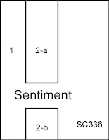
SCS Sketch 336:


Stamps:  Embrace Life (SU!); For You (Rubber-Art Stamps)
Paper:  Basic Black, Garden Green, Whisper White (SU!)
Ink:  Certainly Celery, Garden Green, Always Artichoke, Basic Black; Garden Green Stampin' Write marker (SU!)
Accessories & Tools:  Cuttlebug "Forest Branches" embossing folder, Big Shot, sponges, Stamp-a-ma-jig and adhesives
 
* * * * *
 
I sponged the background of the Whisper White cardstock randomly with Certainly Celery and Garden Green ink.  I stamped the image twice in Always Artichoke and colored in the leaves with a Garden Green Stampin' Write marker.  I cut the images to size and sponged around the edges with Garden Green.

I dry-fit the stamped image pieces on the Garden Green background paper, used my Stamp-a-ma-jig for the placement of the sentiment, and stamped it in Basic Black ink.  I then ran the Garden Green background paper through the Big Shot with the Forest Branches embossing folder.  I lightly sponged Certainly Celery ink on top to highlight the branches.

I mounted all the pieces as per the picture above.

Tuesday, June 07, 2011

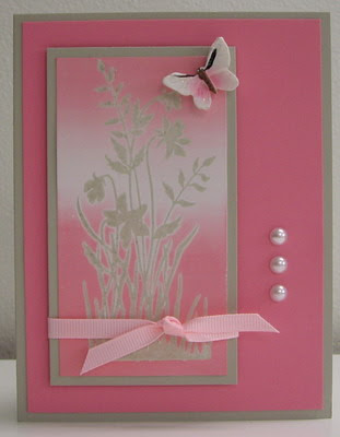
Believing in Pink


Today's color challenge (CC326) is "Regal Pink Mambo", meaning colors to be used are SU!'s colors Regal Rose, Pink Pirouette and Melon Mambo --- along with a Neutral of choice and the dessert option is a round embellishment.  I don't have Melon Mambo, so I substituted Pretty in Pink.  I used my favorite technique (brayering) on the challenge --- oh, and I skipped dessert :)   Hope you like.
 
"Believing in Pink"
 
 
Stamps:  Just Believe (SU!)
Paper:  Sahara Sand, Regal Rose, Glossy White (SU!)
Ink:  Sahara Sand, Pink Pirouette, Pretty in Pink, Regal Rose (SU!); Versamark
Accessories & Tools:  Clear embossing powder, heat tool, Speedball Rubber Brayer, 1/4" Pretty in Pink grosgrain ribbon, butterfly embellishment, three white half pearls, adhesives and dimensionals
 
* * * * *
 
I inked my stamp with Versarmark first and then inked over top with Sahara Sand (this gives me a juicier stamping for the embossing powder to stick to).  I stamped it on the Glossy White cardstock and then heat embossed in clear.

I brayered Pink Pirouette, Pretty in Pink and Regal Rose from both the bottom and the top, leaving some white space in the middle.  I mounted the brayered image on a frame of Sahara Sand and tied the Pretty in Pink ribbon into a knot.

I mounted the pieces as per the picture above, popping up the main panel and adding the butterfly embellishment (from the $1 store!!) and three half pearls.

Quick and easy (and pretty!) card ...

Monday, June 06, 2011

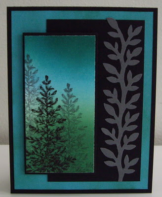
Pine Forest


It's a beautiful and sunny day on the Westcoast.  Looks like spring / summer has arrived!!  And, of course, the most important thing ... the Canucks and Bruins are playing tonight.  GO CANUCKS GO!!!!
 
I headed to the nursery this morning to pick up some annuals.  The weather has been pretty dreary here so I've been waiting for the sunshine.  I should be planting my flowers this afternoon, but felt I HAD to make a card.  It's a "have to" thing now :)
 
I actually did two main panels with the same brayering and images, because I wanted to try doing some different backgrounds.  Here's my first one ... I'll hopefully post the other later today (after the game!).  Hope you like.
 
"Pine Forest"
 
 
Stamps:  Lovely as a Tree (SU!)
Paper:  Basic Black, Tempting Turquoise, Whisper White, Basic Gray (SU!)
Ink:  Tempting Turquoise, Garden Green, Pacific Point, Basic Black, Basic Gray (SU!)
Accessories & Tools:  Speedball rubber brayer, MS vine trim punch, sponge, adhesives, Tombow glue and dimensionals
 
* * * * *
 
I brayer the Whisper White cardstock with Tempting Turquoise, Garden Green and Pacific Point.  The great thing about putting Pacific Point on top of Garden Green is that it creates a beautiful teal color!
I stamped the Pine tree in Black and then twice more in Gray, offsetting the second and third stampings from the first.

I sponged the Tempting Turquoise cardstock with Garden Green ink to tone done the color of the cardstock and have it match more closely with the brayered image.

I punched the vine trim from Basic Gray cardstock and glued it on top of the black panel.
I mounted all the pieces as shown in the picture above, popping up the brayered panel with dimensionals. 
 
____________________ 


Here's the second card using the same main image for the focal point and the same colors of ink, paper and accessories with the addition of the Nestabilities Label Two die-cuts ...


Saturday, June 04, 2011

Lilies for Stephanie


So I've been working on a wedding card for my SIL to give to her niece and I've finally come up with the final version.  Stephanie loves lilies and she loves the color pink, so here's a wedding card I think she'll love!  The photo doesn't do it justice, it definitely is a soft pink, but has much more color than shows below.  As well, it's hard to tell, but I have done rubber band embossing (white on white) on the background paper and there's a white satin ribbon across the middle of the card.  Not shown is the inside of the card.  I made a framed panel of white with pink pirouette and white (so three layers).  I embossed a second stamping of the lilies and colored just the bottom one with some leaves, cut it out and mounted it on the inside panel (bottom right) - it makes the inside as beautiful as the outside!   Hope you like.
 
"Lilies for Stephanie"
 
 
Stamps:  Lilies (Rubber-Art Stamps)
Paper:  Pink Pirouette, Whisper White (SU!)
Ink:  Pink Pirouette, Pretty in Pink, Rose Red, Certainly Celery (SU!); Versamark
Accessories & Tools:  Nestabilities Label Two (Spellbinders), Big Shot, white embossing powder, heat tool, rubber brayer, rubber bands, 5/8" white satin ribbon
 
* * * * *
 
I stamped the lilies in Versamark onto Whisper White cardstock (twice) and quickly heat embossed it in white.  I colored in the lilies with Stampin' Write marker Pink Pirouette and the leaves with Certainly Celery.  I took a small eye-makeup sponge and added Pretty in Pink ink to the middle of all the petals of the lilies.  I colored in the stamens with a Rose Red Stampin' Write marker.  As mentioned above, I did a second embossing and colored in just the bottom lily with some of the leaves.  Then I cut both the lilies out (the small one for the inside of the card).

I rubber band embossed (see techniques page for instructions) the background Whisper White cardstock with white embossing (very subtle).  I then mounted all the pieces as shown in the picture, popping up the main framed panel with dimensionals.
 

Friday, June 03, 2011

Misting Morning at the Lake


I haven't been feeling well lately and realized that I'm going through withdrawal --- brayering withdrawal, that is!!  :)
 
I've been doing lots of the on-line challenges rather than making cards with ideas I have whirling around in my head.  Today I decided it was time to get back to more of just making whatever comes to me.  Here are the results ...    Hope you like.
 
"Misty Morning at the Lake"
 
 
Stamps:  Sketch of Nature (trees), Birch Tree Paintings (grass) - Innovative Stamp Creations (ISC); Vintage Labels (sentiment) - SU!
Paper:  Baja Breeze, Early Espresso, Whisper White
Ink:  Baja Breeze, Early Espresso, Basic Gray; Stampin' Write Marker Early Espresso
Accessories & Tools:  Speedball Rubber Brayer, post-it notes and scrap paper for masking, sponges, adhesives
 
* * * * *
 
This is a very simple brayered card, done as follows:  I masked the horizon line with a post-it note, covering the sky area with the mask.  I brayered Baja Breeze from the bottom up to the mask.  I removed the mask and brayered Baja Breeze from the top down about 1/3 of the way, leaving a white space in-between the sky and the water.

I placed the post-it note mask back on the horizon line, this time covering the water and then randomly ripped a scrap piece of paper to create the mountains in the distance (low range).  I placed the ripped mask covering the sky and used the brayer to add Early Espresso ink for the mountain range, re-inking the brayer and going over it several times to make it as dark as possible.  I removed all the masks.

I stamped the tree in Early Espresso ink on the left hand side, about 1/2" or so below the horizon line.  I used the Stampin' Write marker to fill in the trunks of the trees and make them dark.  I used a small eye-makeup sponge to add ink to the "leaves" of the trees.  And, I sponged ink around the base of the trees and down the left side and most of the way along the bottom to create the bank of land along the lake.

I sponged Basic Gray lightly along the tops of the mountain range and also underneath the range in the water.

I stamped the grass several times along the bottom of the card in Early Espresso ink and stamped the sentiment on the right hand side.

Thursday, June 02, 2011

Copper Oak Leaves


Today's challenge is "Ways to use it" (WT325) and it's all about Die-cuts.  I challenged myself to use a die-cut that I've had for ages and haven't used yet ... at least not the oak leaf (it's a set of four leaves).
 
When I think about using the leaves, I automatically think of the copper technique.  I cut out the oak leaf using my Big Shot and a copper sheet that my friend Lili gave to me.  I also punched out a medium oval from the copper sheet to use as a frame for my sentiment.  Then I heated the copper using a butane torch (I use my crème brulee torch ... it's small and easy to manage), until the copper starts to change color.  Beautiful!   Hope you like.
 
"Copper Oak Leaves"
 
 
Stamps:  Vintage Labels (SU!)
Paper:  Early Espresso (SU!); Copper cardstock
Ink:  Versamark
Accessories & Tools:  Copper metal sheet .005 thickness (K&S Precision Metals), Sizzix Leaves #2 Die-cut, butane torch, copper wire, medium oval punch, small oval punch, Sizzix Square Lattice embossing folder, Big Shot, Copper embossing powder, heat tool, sticky strips, glue dots and dimensionals
 
* * * * *
 
I used the Sizzix die-cut and Big Shot to cut out two oak leaves from the copper sheet.  I also punched out a medium oval from the copper sheet.  I torched all the copper pieces until the colors changed.
I ran a piece of Early Espresso cardstock through the Big Shot with the Square Lattice embossing folder.  I then tore the embossed cardstock and mounted it on top of a piece of copper cardstock.

I cut three pieces of copper wire and wound them around the end of a small artist's paint brush to create a coiled look.  I used needle-nosed pliers to twist them together.  I placed the oak leaves' stems covering where the copper wire joined and glued it together using glue dots.  I added dimensionals and glue dots to the back of both leaves and mounted it onto the copper cardstock.

I punched out a small oval from Early Espresso cardstock, stamped and embossed the sentiment in copper and mounted it on the copper torched frame and adhered it to the card.