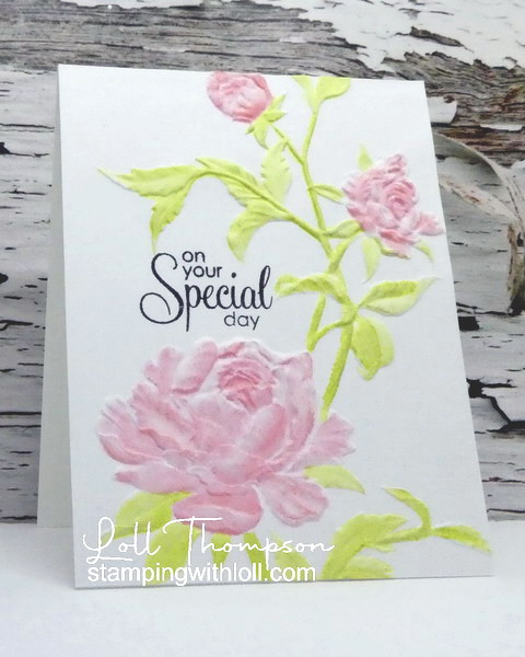
Hi everyone. This month our Group of Seven Cardmakers had fun Colouring Dry Embossing. Bonnie made a couple of cards back in February, and shared the two ways she coloured dry embossing; sponging and watercolouring. Bonnie led the team and showed us how she made the cards and shared a third alternative - inkpad swiping. Thanks Bonnie!
Please check out the details for the technique and link to video on the blog ...
I do love to watercolour dry embossed images and have done it several times in the past (see below for more samples). This time I used soft colours of distress inks (Shabby Shutters, Saltwater Taffy, Abandoned Coral) to watercolour the embossed image of Roses (Tim Holtz) on mixed media paper. I finished the card with a sentiment from Gratitude (Penny Black), stamped in black for contrast.
Close-up ...
It's the first time using this embossing folder, so I'm sending this card to NBUS Challenge #52.
Another card using similar colours ...
This time I simply sponged over the raised design. Again with Saltwater Taffy, Abandoned Coral, Shabby Shutters, and also Peeled Paint, Mustard Seed, and Chipped Sapphire distress inks. This was a really quick and easy card.
Thanks for stopping by!
If you would like to subscribe by email,
please fill out the subscription form in the upper right sidebar.
Make sure to add "subscribe" to the message.
It is also important to add SWL1subscribers@gmail.com to your contact list
so Google recognizes the address and delivers the updates.
To unsubscribe, please use the same form making sure to add
"unsubscribe" to the message.
Thank you.
Card #1:
Stamps: Gratitude (Penny Black)
Paper: White card stock (Neenah 110 lb.); Mixed Media paper (Strathmore 140 lb.)Ink: Distress Inks: Shabby Shutters, Saltwater Taffy, Abandoned Coral (Tim Holtz); Black (Memento)
Accessories: Roses Embossing Folder (Tim Holtz), paint brushes
Card #2:
Stamps: Many Everyday Messages (Hero Arts)
Paper: White card stock (Neenah 110 lb.); Mixed Media paper (Strathmore 140 lb.)Ink: Distress Inks: Peeled Paint, Worn Lipstick, Mustard Seed (Tim Holtz)
Accessories: Peony Bundle Folder (Simon Says Stamp), sponges, blue pencil crayon
Challenges:


29 comments:
Card #2 REALLY tickles my fancy....TFS Loll!
Paper Hugs,
Jan
Beautiful!
Sandy xx
Beautiful cards. You have managed to contain the colour on the raised sections very well. Is there a trick? It always goes where I don't want it to when I do it. Perhaps I need some fine detail brushes xx
What beautiful embossing folders you used here Loll - and such lovely delicate colors used - especially love the shading on the blooms and leaves on your second card! Julia xx
Gorgeous cards, I'll have to try this.
This is such a great technique Loll, the results are so soft and pretty. :)
This was such a fun technique and one I will be using lots in the future.
Beautiful watercolouring of the embossed image Loll. You have really mastered that technique ♥
You managed to get a wonderful range of colours and shading! I'm so impressed! Such beautiful cards!
I love how you are able to finesse the colors so flawlessly over the 3D embossing, Lolly! The subtle tones make beautiful cards, whether paint or ink and you don't lose the dimension, which I find so hard. It's impressive! Love, Dolly (And thank you for sharing with everyone at NBUS!)
Two beautiful Colouring on 3D Embossed Images using 2 different techniques, Lolly Your colors are the same, but you got different subtle beautiful soft floral images:-) I LOVE both cards equally and want to try your techniques. Thank you for sharing, my dear friend. This is a fabulous technique choice for the July Group of Seven Cardmakers. Love and Hugs...Nancy
Two really pretty cards Loll, and I love the different effects you get with the different techniques!
Blessings
Maxine
Beautifully done.
Beautiful coloring of the embossed flowers. You did a greay job!
Lia DT CYHTP
Gorgeous examples Loll.
Faith x
Those are beautiful embossing folders and you dressed them up so fancy with those soft colors. Both techniques look wonderful and made lovely cards.
Both cards are lovely, Loll.
Fabulous cards, Loll. The designs are so pretty. xx
Your first card is even prettier in person, Lolly! I love the soft watercoloring and wonderful dimension! You've achieved wonderful color shading on the second card with the sponging! A very different but equally beautiful look, my friend!
Two beautiful florals, Loll, especially love card two with the coral colors!
Both cards are gorgeous Loll, love the watercolor look and I also love the sponged look. I remember back in the day using chalks on the regular embossing panels, we thought that was the bomb then. LOL Hugs, Brenda
Very pretty! I've not tried water coloring the 3D folders, only coloring with Copics, but these are really gorgeous!
Your two cards are so pretty Loll, a great technique from the Group of Seven.. must motivate myself... I've dabbled with your inspiration the last two months and failed to get up a post.... keep on inspiring me and everyone with your wonderful ideas and cards, Robyn
I love anything to do with coloring embossing folders. The 3D's make it really nice. You have two absolutely gorgeous samples here, Loll. Your watercolored embossing is flawless and I'm totally smitten with the softness of the second card. So lovely!
Terrific twofers. My favourite is your gorgeous watercolourimg on the first card.
I like your clean designs on both cards, Loll! They're both so pretty and feminine!
Both cards are so pretty, Loll! I love how the subtle tones add such elegance to the 3D embossed cards. I especially love the "not-so-crisp" impression of the first card, and your fluid watercoloring is perfect for the embossed image. The size and placement of the sentiment are just right too.
Hideko xx
These are both BEAUTIFUL cards Loll! I love the softer coloring on both...they both really POP against all the white! I always worry I'll mess up outside of the lines with this technique...maybe I need to be brave and try again!! Hugs. :0)
Two gorgeous cards Loll using really pretty folders. I love how the different colouring techniques result in very different looks. The second card is particularly inspiring - the fade out sponging makes the flowers and leaves look beautifully delicate. Vicky x
WOW! Stunning cards. Especially the first card with its soft colors that have settled so realistically on the rose petals. I am captivated by this card, Loll!
xx
Post a Comment